Pangolin Web Application Tutorial
Sample Data
Download example sequence data: cluster.fasta
Download accompanying sample metadata: cluster.csv
Uploading the Sample Data
Navigate to pangolin.cog-uk.io, the home screen of the pangolin web application.
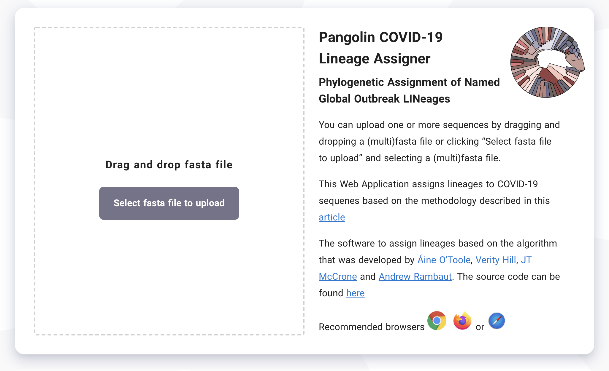
From this screen you can drag and drop a fasta file containing one or more SARS-CoV-2 sequences to upload your sequences into pangolin. Note that the sequence names are anonymised and no identifying information is stored, however uploading to pangolin does mean your sequences will be analysed on a remote server.
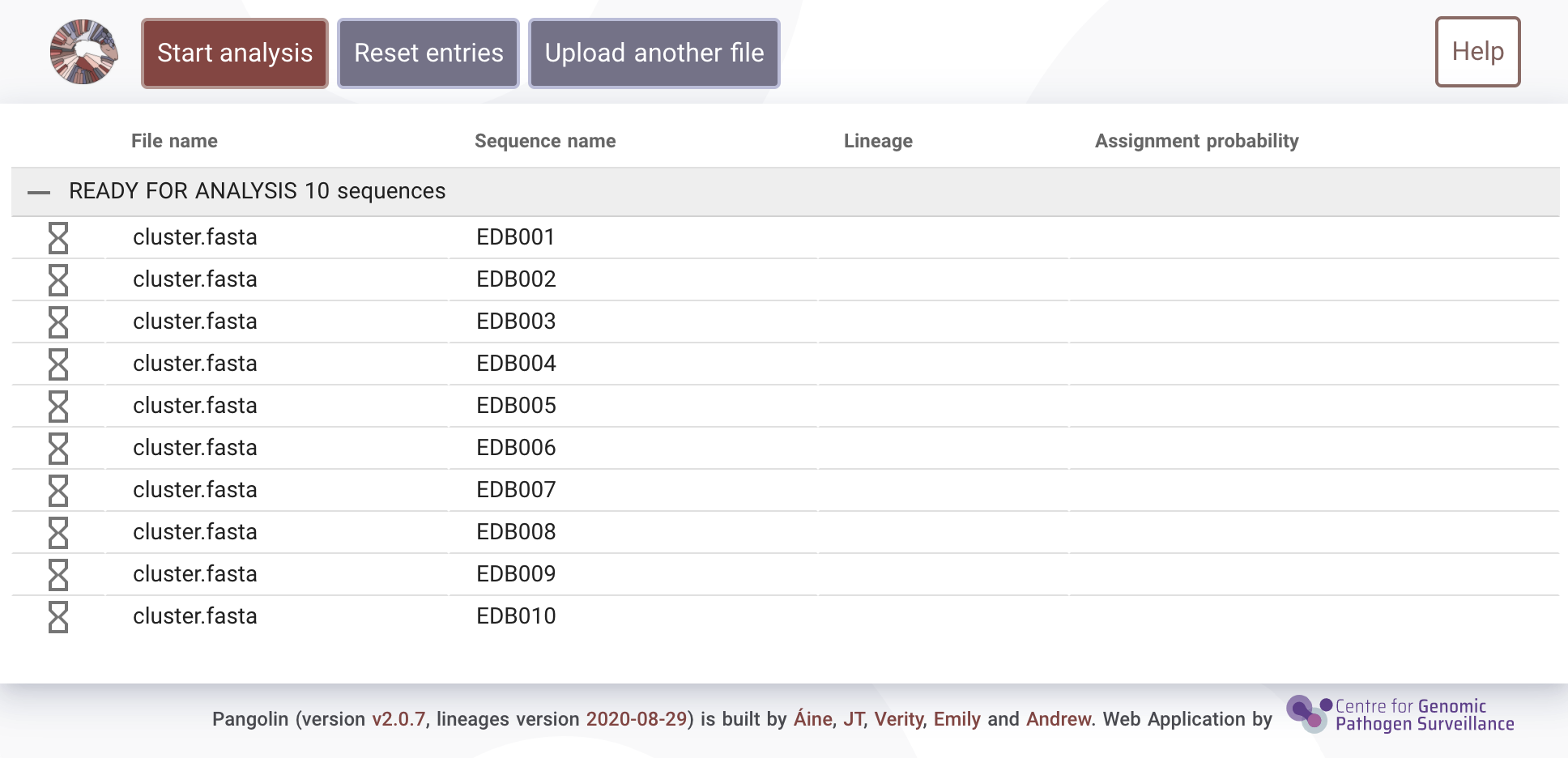
Once your sequences have uploaded you'll see the following screen meaning the sequences are ready for analysis.
Starting the Analysis
Click on the "Start analysis" button to begin running pangolin. Your sequences will be assigned their most likely lineage based on the most recent pangoLEARN machine learning model.
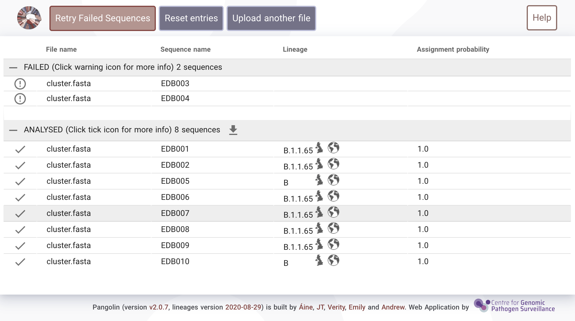
Failed sequences
Occasionally sequences will "fail" to be analysed for QC reasons. Select the exclamation mark (!) to see more information about why a sample failed. Reasons for failure may be:- A sequence may have too high N content
- It may be too short
- It may be too diverged from SARS-CoV-2
Button descriptions
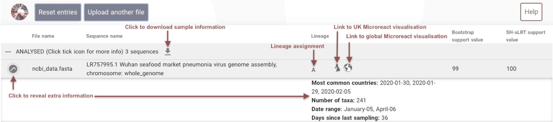
Play around with the results on the screen, pressing the tick button will give you more information about the lineage and clicking on the map buttons will link out to Microreact, a web-visualisation tool that has been adapted to display SARS-CoV-2 lineages.
Microreact
A great instructional video showcasing microreact can be found here.
Click on the Globe icon next to one of the sequences that have been assigned lineage B. You should see the variety of panels in the microreact web app, including a map showing the global spread of lineage B (upper left), where lineage B lies on the global tree (upper right) and sequence counts over time (lower panel). All panels are interactive and displays can be customised by clicking the upper right logo on each panel.
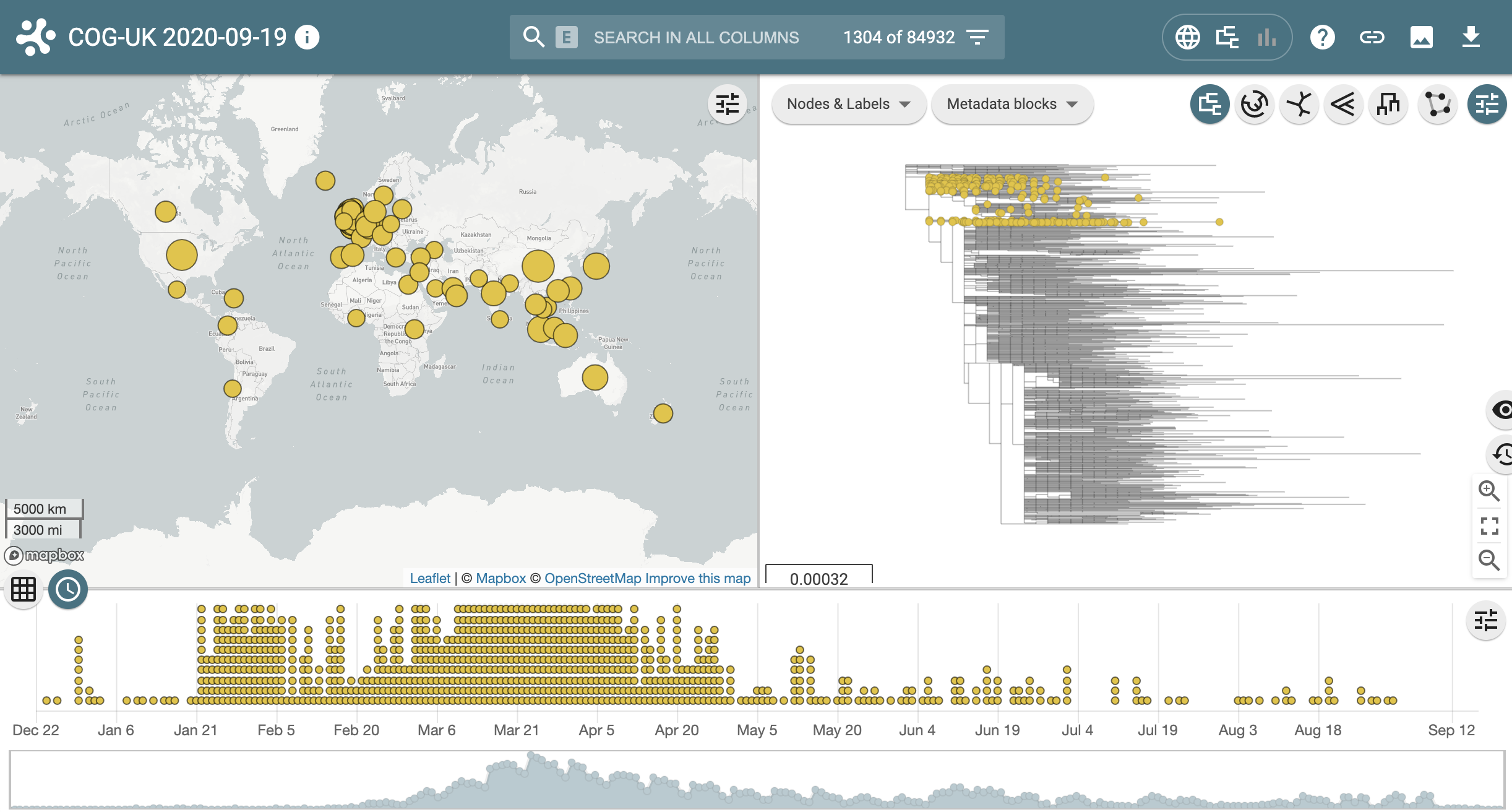
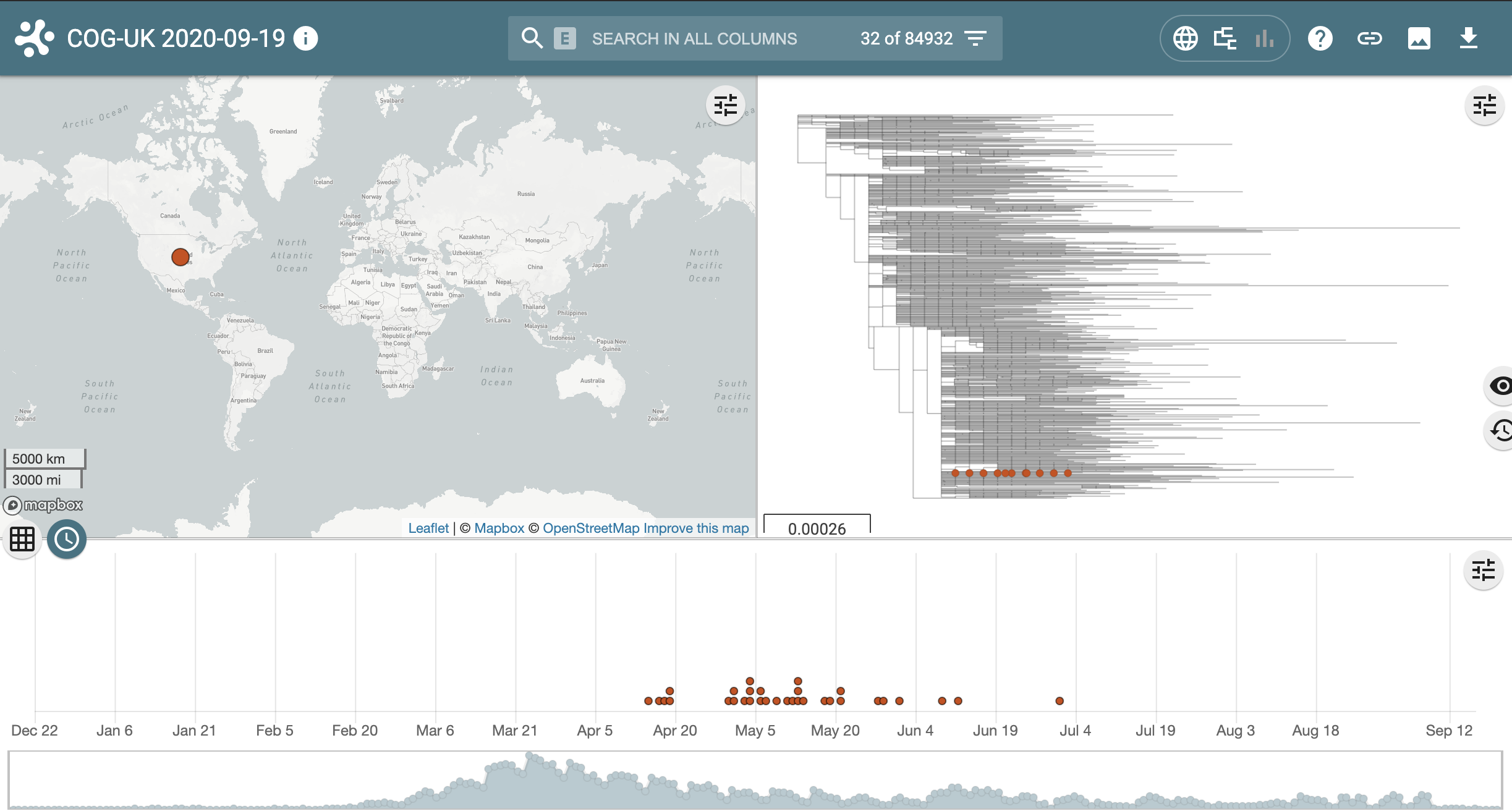
Next return to the pangolin results page and link out to microreact for the other lineage, B.1.1.65. Notice this lineage is much smaller and much more geographically confined.
Navigating Microreact
Map Panel
Selecting a single point on the map highlights samples in other panels from just that location. Additionally, by clicking the map menu (top right of map view) the lasso tool allows a user to click and draw a bounding area around locations of interest which will filter the tree, timeline and chart panels to only show data from the region selected.
Further options are available from the map menu including options for marker style and choice of background tiles - web mapping servers can be linked to to display different tile layers.
Tree Panel
The phylogenetic tree can be zoomed in and out to enable subsets of data to be viewed in detail. Selecting a leaf on the tree will highlight the geographic and temporal location of that genome and selecting an internal node on the tree filters the map, timeline and chart panels to only show data related to the branch selected. Clicking outside of the tree will deselect the filter. Right clicking an internal node displays options for viewing a subtree / rerooting or rotating the branch. Further options are available from the tree menu located at the top right of the tree panel including tree shape and options for nodes and labels.
Chart Panel
The default view shows the distribution of lineages within the dataset and clicking a particular lineage will highlight on the map and timeline all those locations and dates corresponding to the selected lineage. The chart menu, located at the top right of the chart view, indicates the parameters charted allowing a user to change the graph type and axis attributes and explore data further.
Timeline Panel
The timeline shows the temporal position of all data ranging from the first to last dates as points on the timeline.A summary overview is shown below the detailed timeline. Selecting a single point highlights the location of the selected sample within the map and tree panels. The timeline menu, located at the top right of the timeline enables control over the point view and also a set of controls enabling an animated view of data to be ‘played’ with control over the animation speed and time window. Furthermore, the bottom summary view can be used to position the first and last time point displayed in order to filter the samples displayed in other panels.
Data Table Panel
The data table can be accessed by clicking the table icon at the top left of the timeline panel. Any column can be filtered by entering text criteria from the filter icon within each column heading, allowing, for example, filtering lineage by a lineage ID. Filtering updates all other data panels.
Saving ‘Views’
At any point within exploration of data, the ‘state’ - ie the zoom level of map/tree/timeline along with any filtering of data (via visual or textual filtering) can be saved using the ‘link’ button at the top right of the microreact window, creating a permanent URL which can be shared to allow revisiting of the view without needing to reapply filtering.
Summary
- It's very simple to use the web app to assign lineages with pangolin
- Some lineages are very large and geographically widespread
- Some lineages may only have a handful of sequences and be limited to a single location
- Microreact summarises the most up to date data from COG-UK, displaying pangolin lineages